
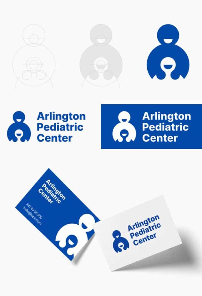
Emanuele took on the challenge of redesigning these logos as if they were real client projects. With a refined approach to typography, thoughtfully crafted logomarks, and careful attention to the original brand colors, he’s transformed each one while preserving its essence.
Which redesign do you think stands out the most? Dive into the project below and let us know your thoughts in the comments!
1.


2.

3.


4.


5.

6.


7.


8.


9.


Read more: The Psychology of Logo Colors and What They Signal to Customers
Related Posts
Color psychology is the study of how colors affect human behavior and emotions. According...